Client: Tikitiko
Project Specifications: uniform, packaging, & logotype
The Challenge
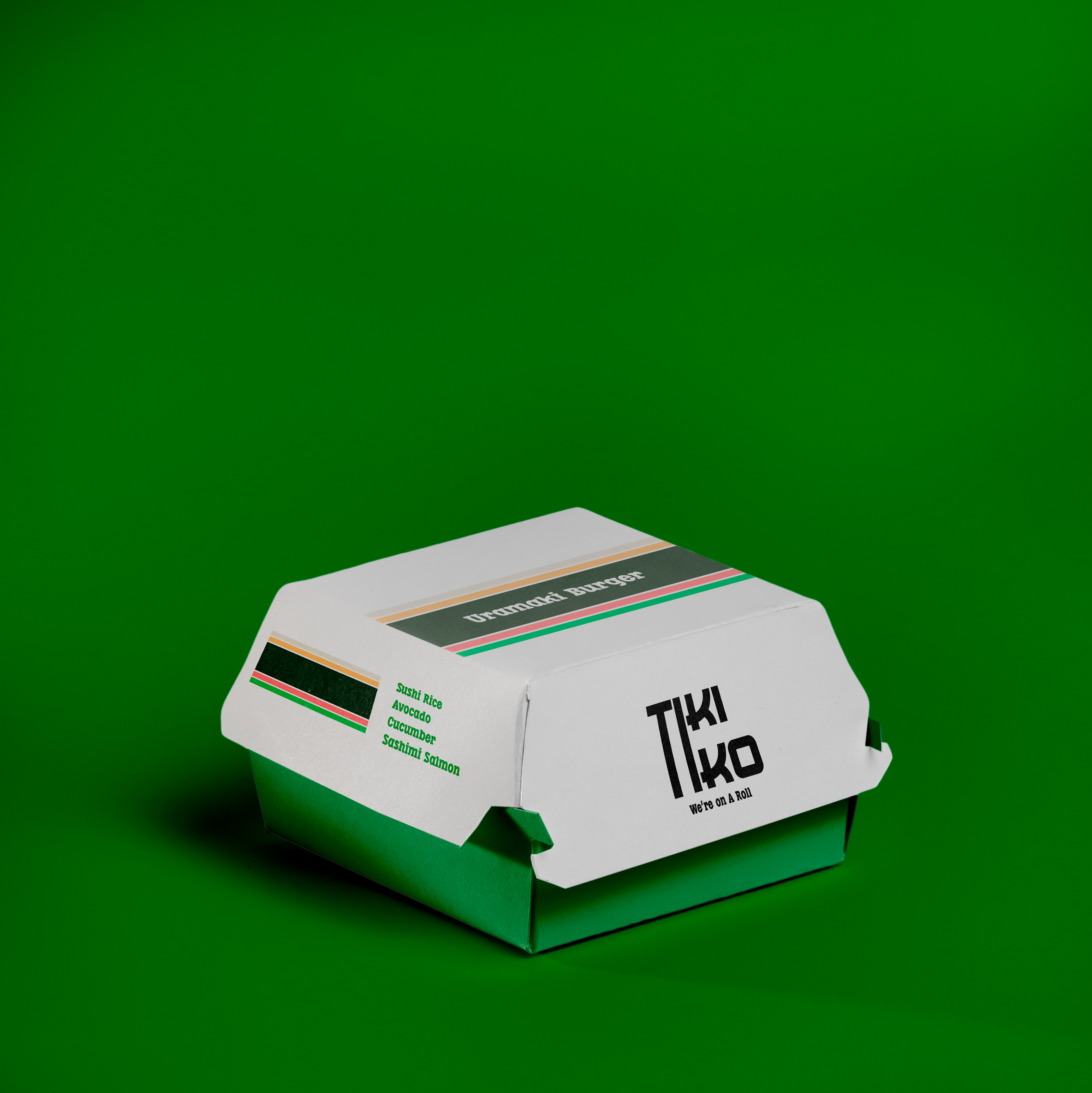
Tiki Tiko is a Japanese fast food restaurant that serves sushi sandwiches. The creative brief for the logotype emphasizes that it must support Japanese cultural characteristics. Since this is a fast food chain, the brand also desired to be recognized from a distance. They intended to both core and secondary audiences see them to be welcoming and entertaining.
Solution
The logo was manipulated with the letters "T" and "I" to give the WORD MARK a PLAYFUL look for FLEXIBILITY. The combination of the letters "T" and "I" creates a sense of balance in the space. They can also be identified from a distance because they are more prominent than others. The logo is a throwback to the company's early days, when they perfected the Japanese style of signage. A specific shade of red was chosen to influence people to use the brand because the terminology of red increases the APATITE to taste and use their service. The logotype can be placed on a horizontal rectangle shape inspired by Japanese design and first introduced in 2000.
Results
The brand system worked flawlessly with the brand's origins. The logotype met the creative brief because it worked with a variety of color tones, including monochrome, negative space, and a greyscale shade. The burger packaging was designed to showcase the sushi's burgers; they are visually appealing with a modern and fresh design.
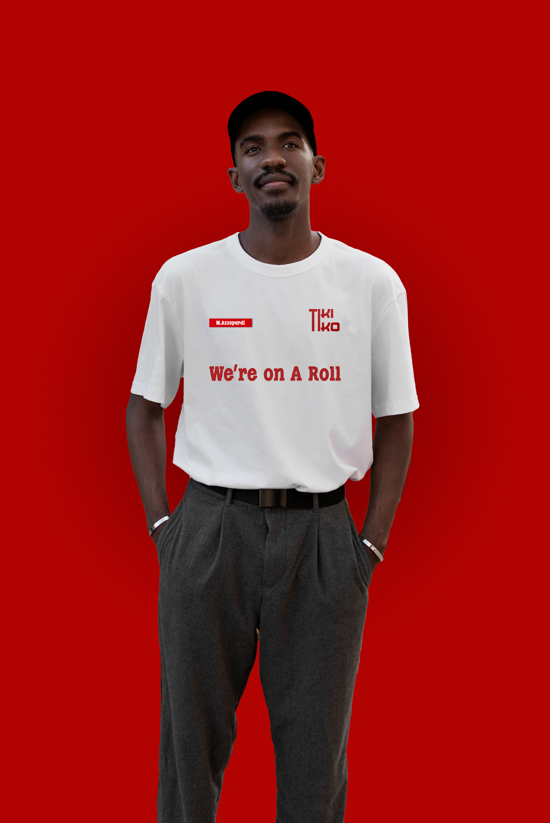
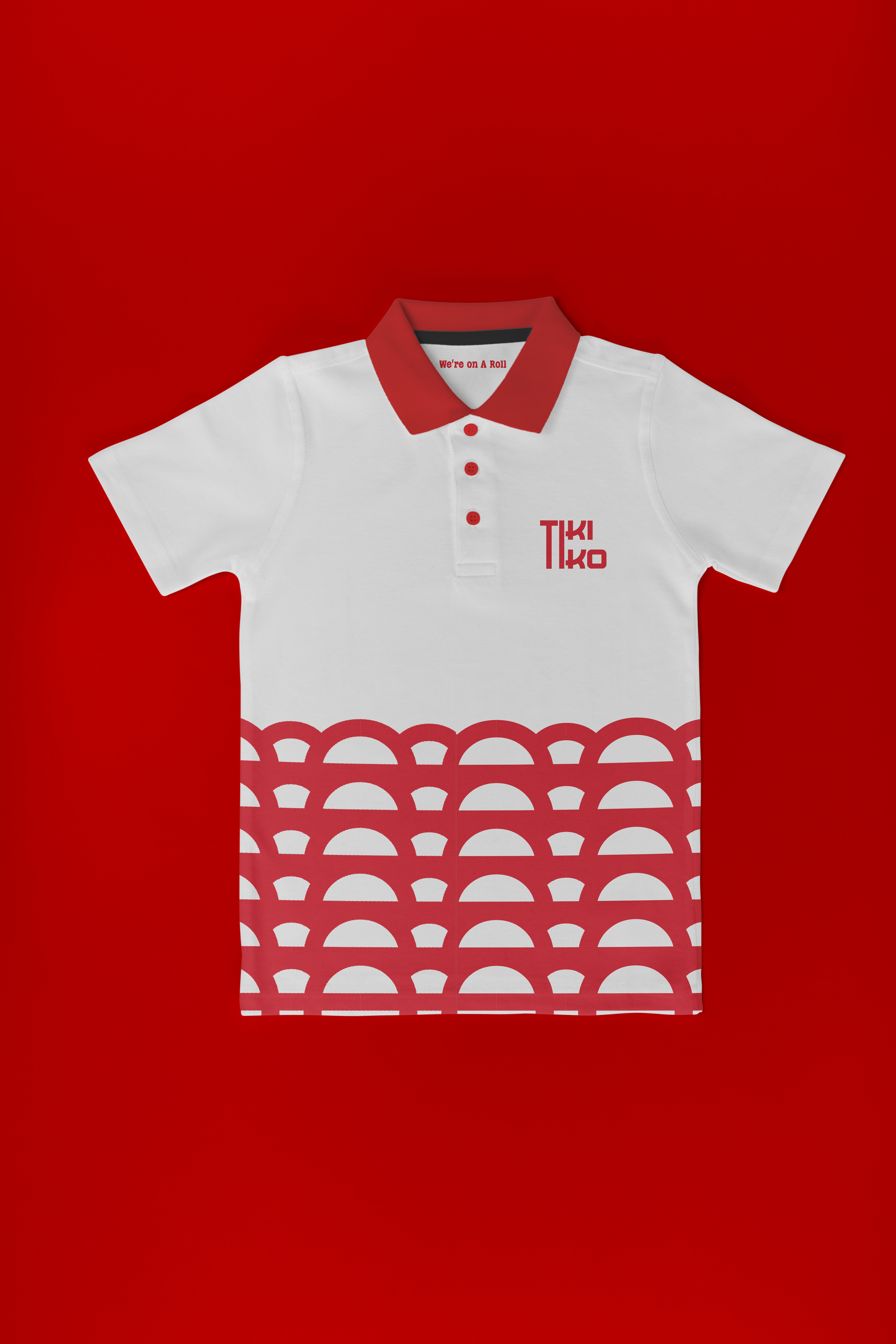
T-shirt Uniform Design
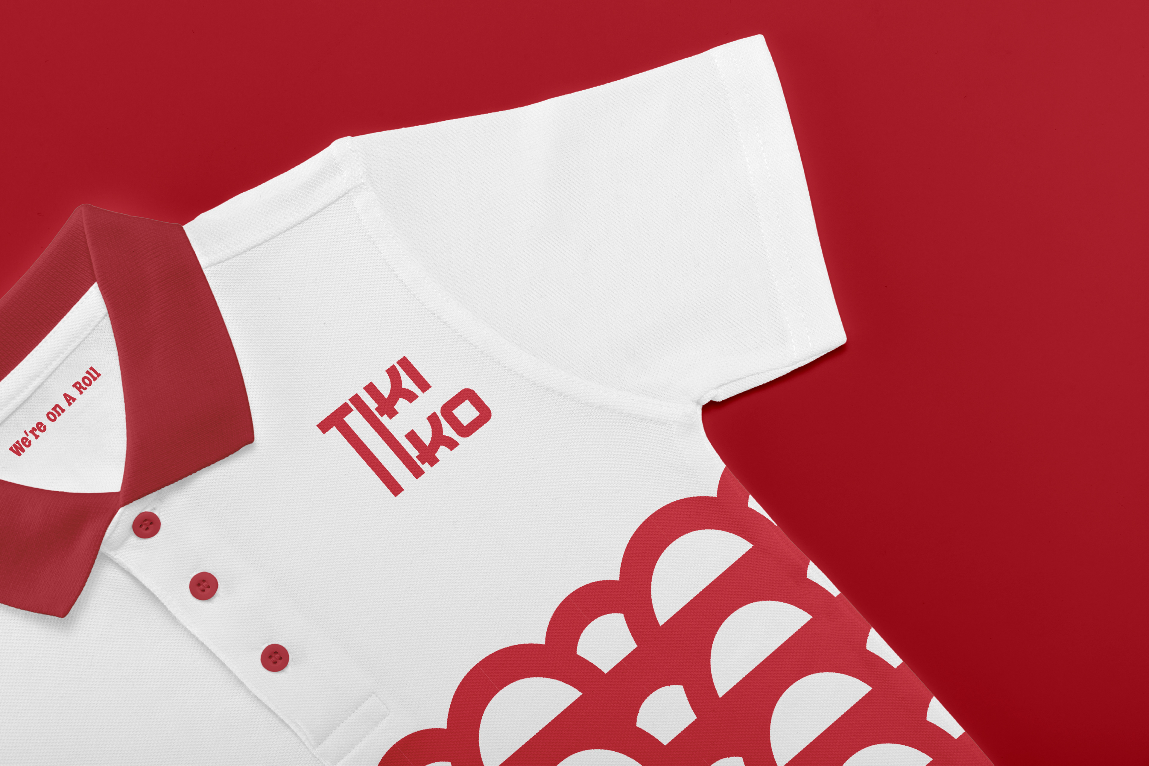
Polo Uniform Design
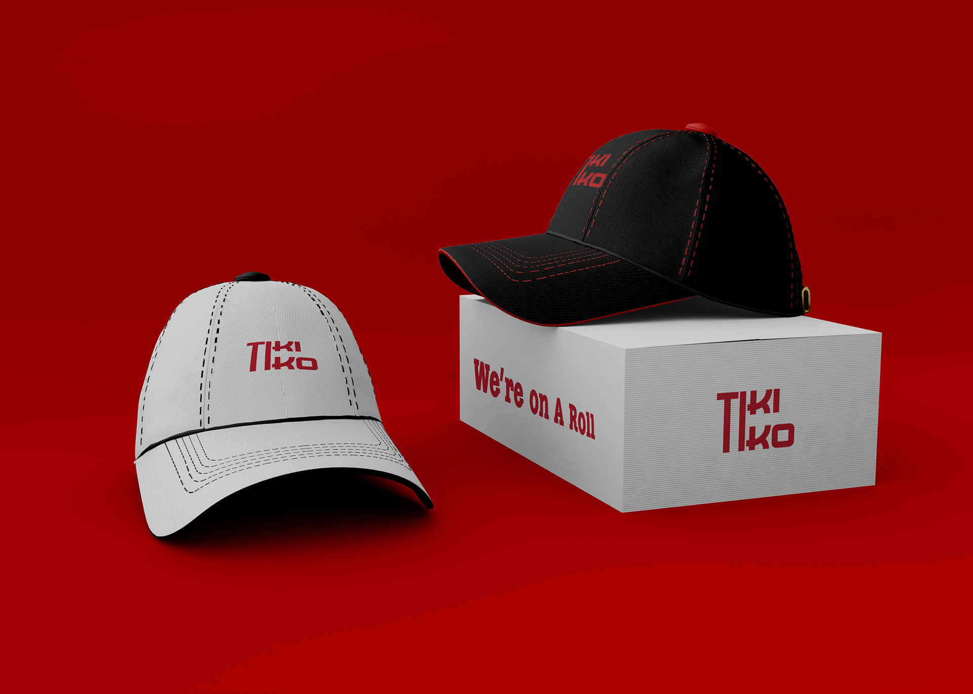
Hats
Full photo of the uniform
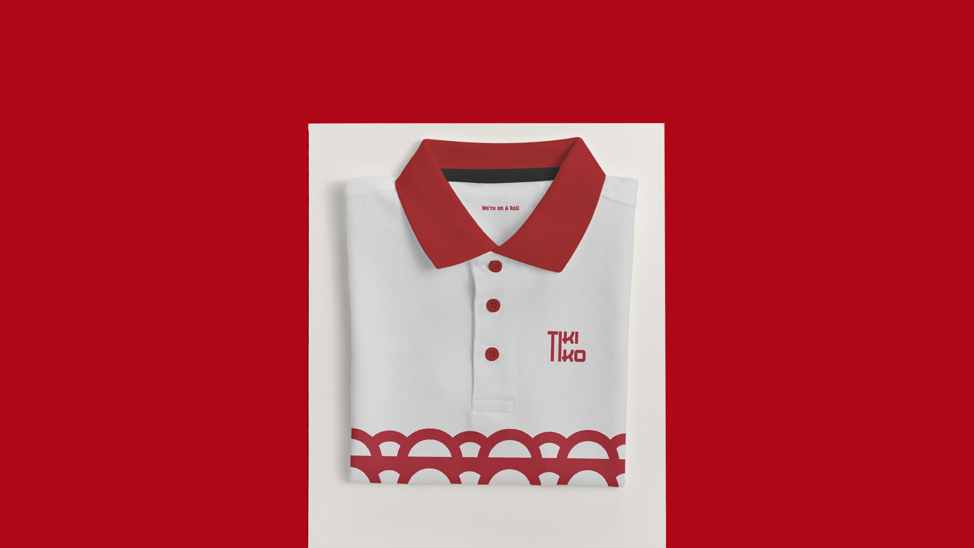
Uniform Mockup
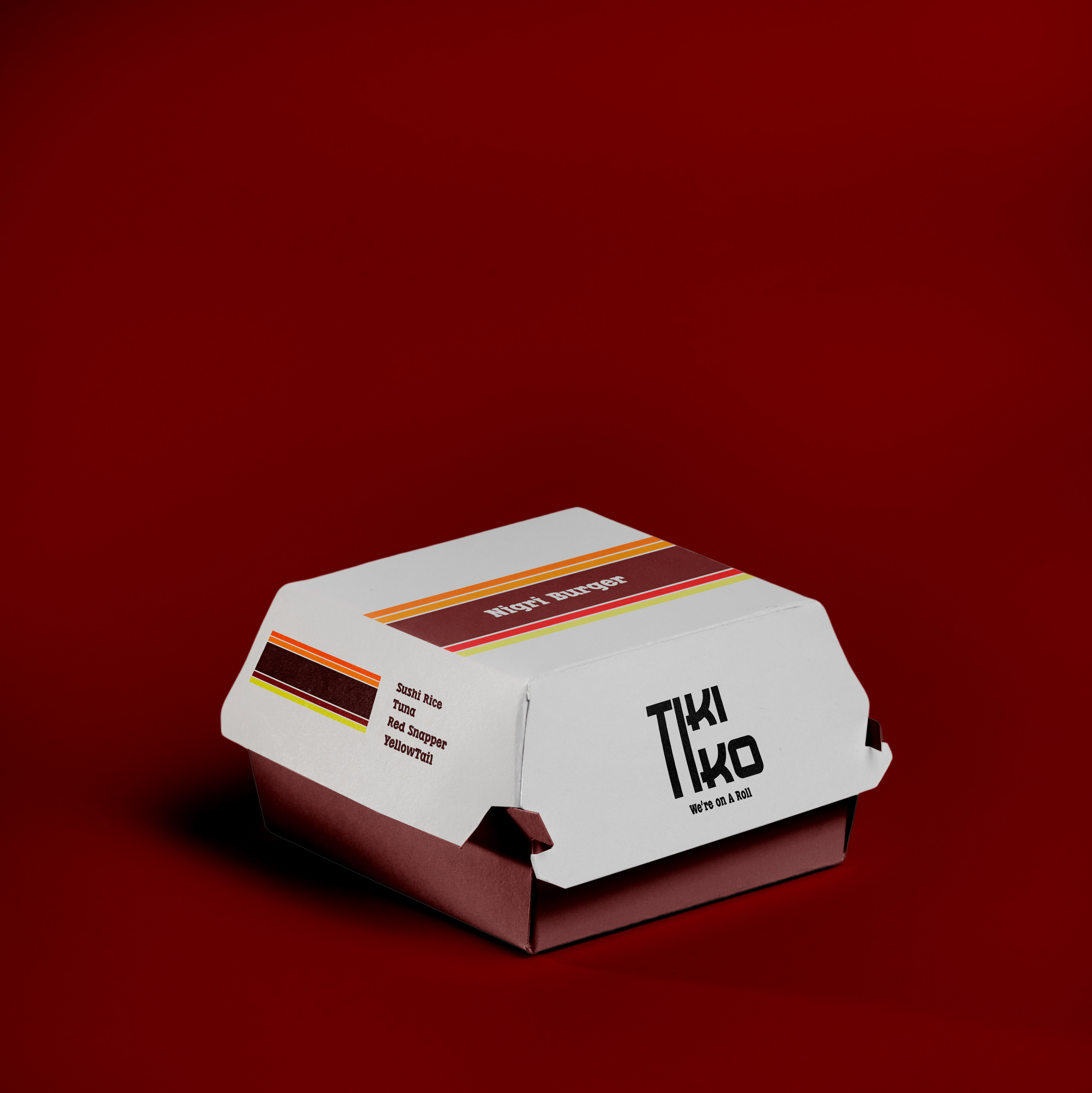
Nigri Sandwich Packaging
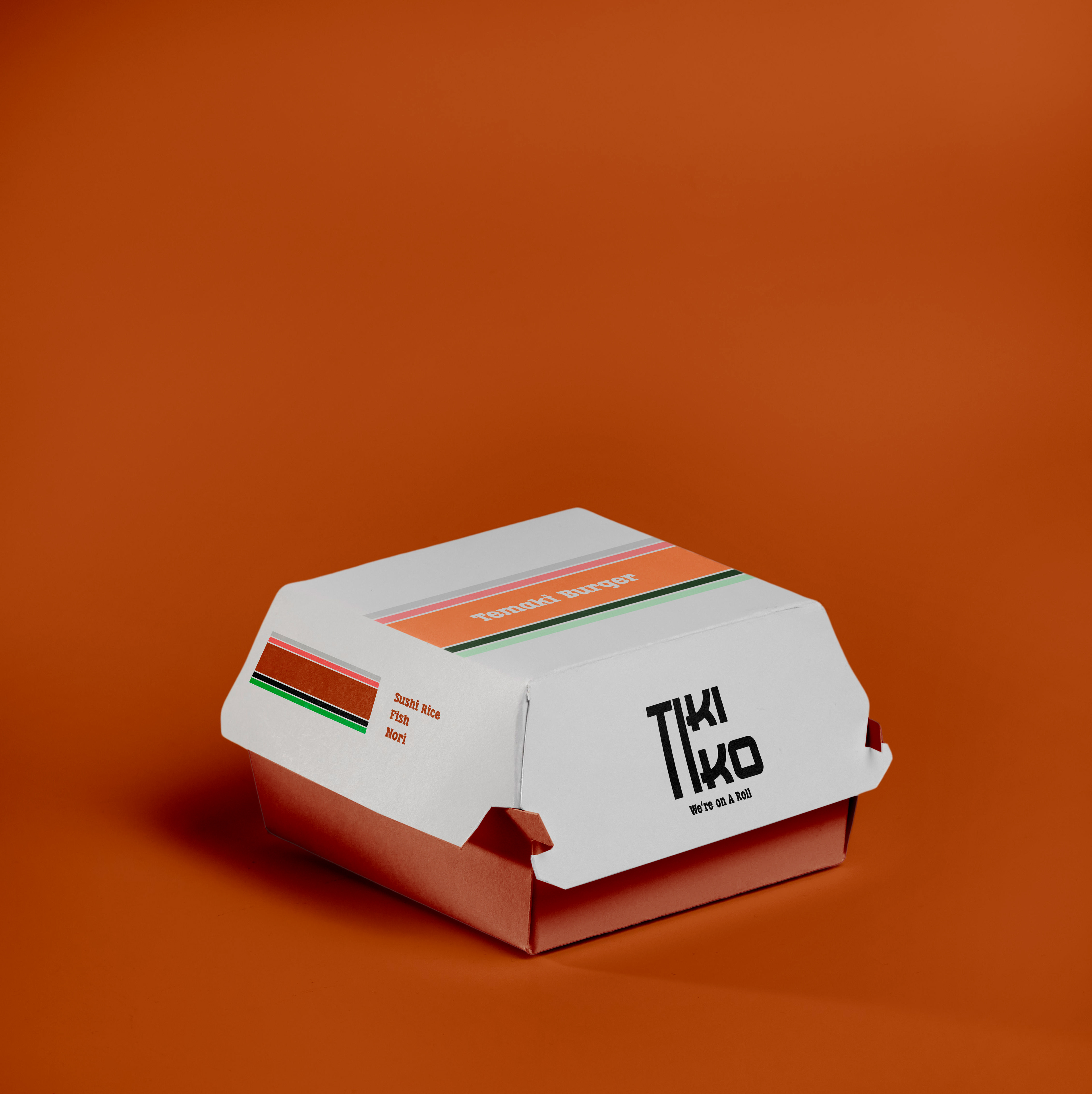
Temaki Sandwich Packaging