Client: Avukati Vella
Project Specifications: Logotype, Stationary, & Signage
The Challenge
Avukati Vella is an advocate company that established the brand last year. I was approached to create a cohesive brand look for their service. Avukati Vella wanted their logotype to be fresh and different from others competitors to create a fresh and modern style into their brand core values.
Solution
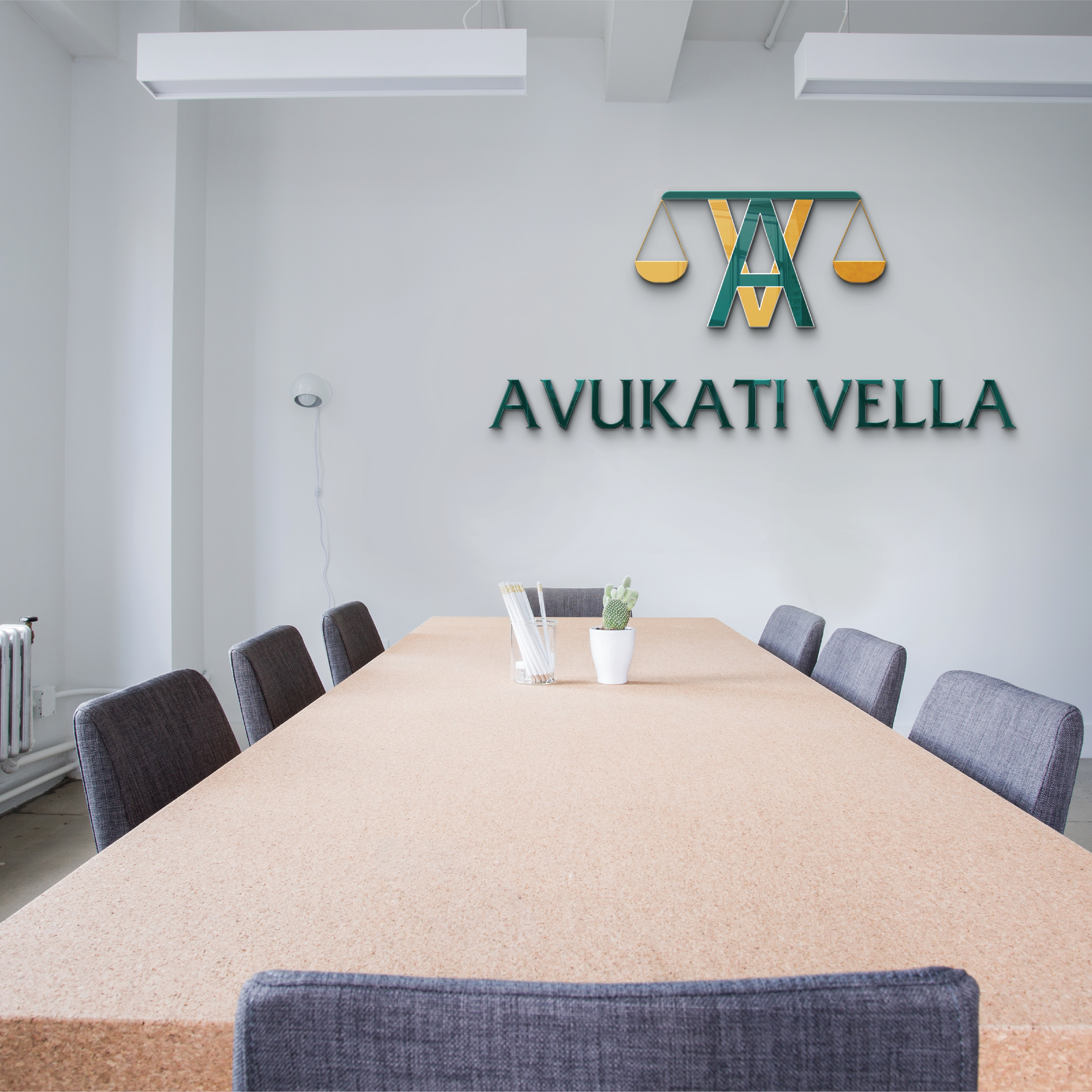
Since the brand is about advocates their symbol is manipulated with the brands initials to make it recognizable by the symbol it-self so in the long term turn the symbol could be used independent. The symbol has the scale of justice to show the balance towards the characters. The symbol is based on two colors to creates a harmonic style, the symbol is dived with white lines. The rationale behind this ideas was to represents their sharpness when it comes quality into their service. The colors represents an elegant and comfort style where lead to everyone to be comfort into their service. The typography accompanies the rationale with sharp edges. The typeface make the brand to be look more serous, elegant and stronger from their competitors.
Results
The brand really hits it’s mile-stone objective and goals within months from they were expecting. The office with the chosen colors really make the people feels comfortable to trust into their service.
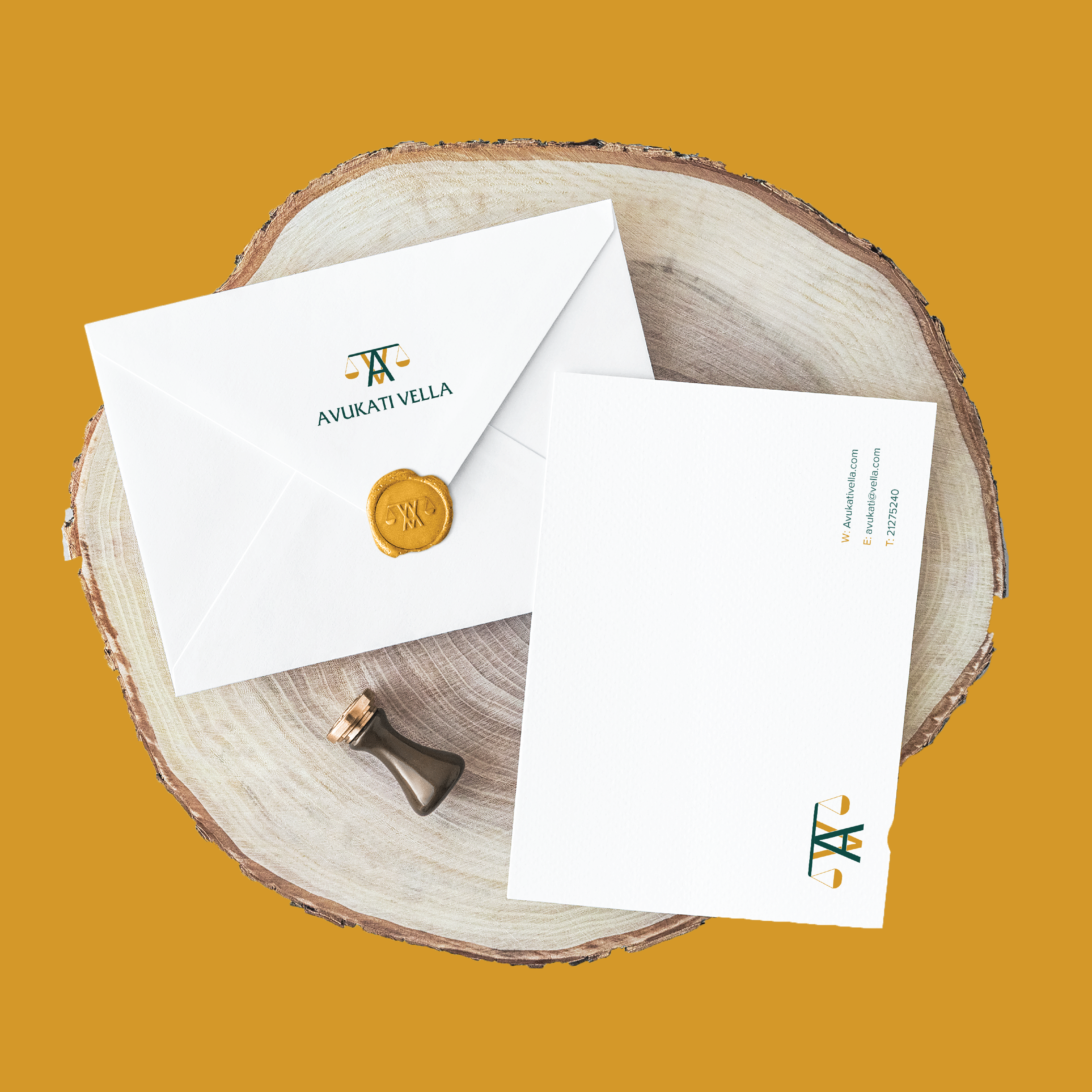
Dl Envelope
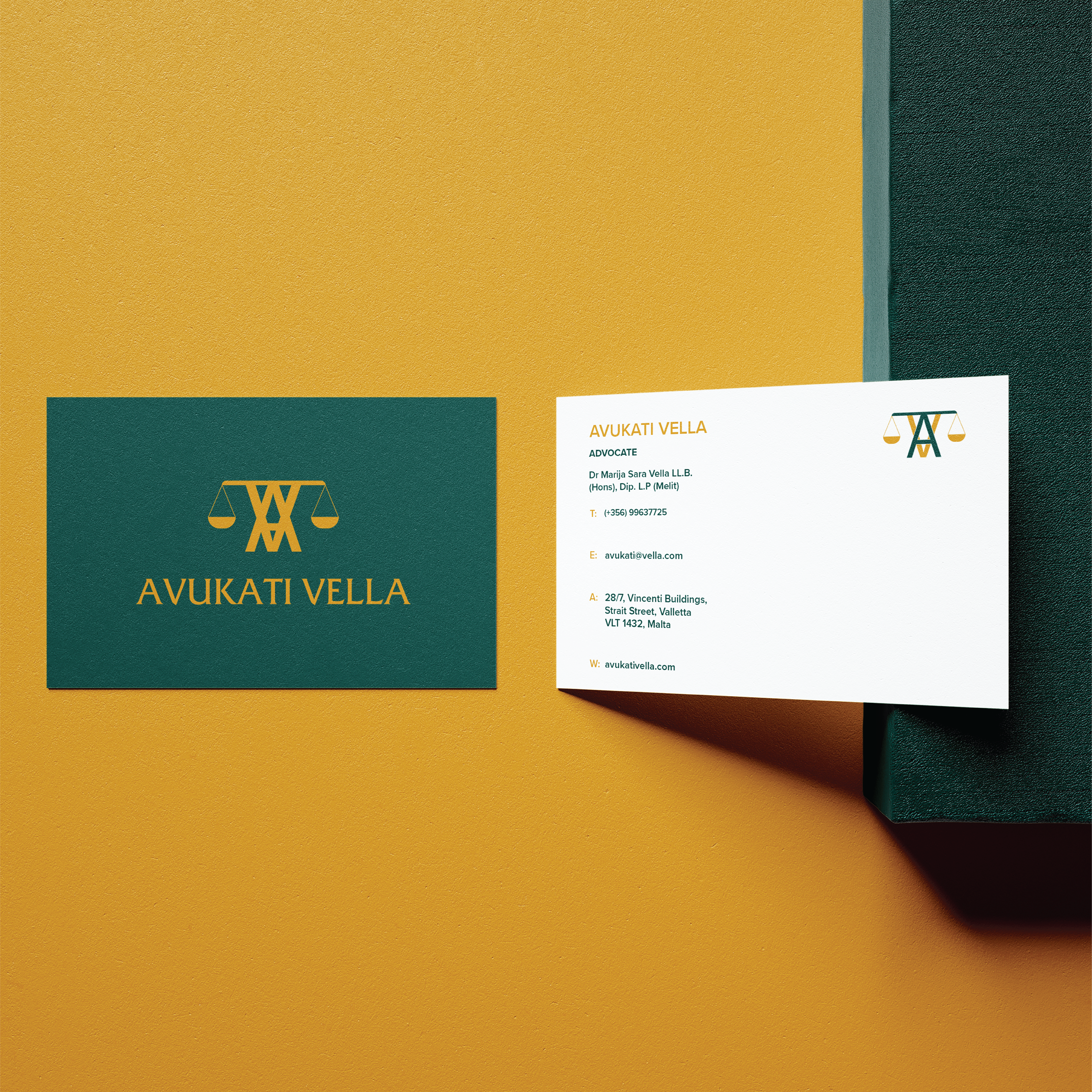
Business Cards