Client: Casa Decor
Project Specifications: Logotype, Packaging, & Backdrop
The Challenge
Casa Decor imports furniture and decoration from Morocco. It was a little bit of a challenge to introduce a Muslim style decor into Christianity spirit in Malta.
Solution
The solution trough the problem that they might be face was solved trough the brand strategy. The logotype look eye catching and dynamic. The color scheme of the brand is energetic and fun. The logotype is build up with thee three shapes that forms a Moroccan architecture tradition style. Each one of them represent the Beauvoir of a customer. The first step means the first achievement that the buyer is entering the territory, the second step means that the buyer is concluded his ideas and thoughts about his style and decision for he’s home decor, and the last decision means that the costumer will make the sharp decision with pride. The shapes are accompanied with a Moroccan architecture frame that compliments the visual theory.
Results
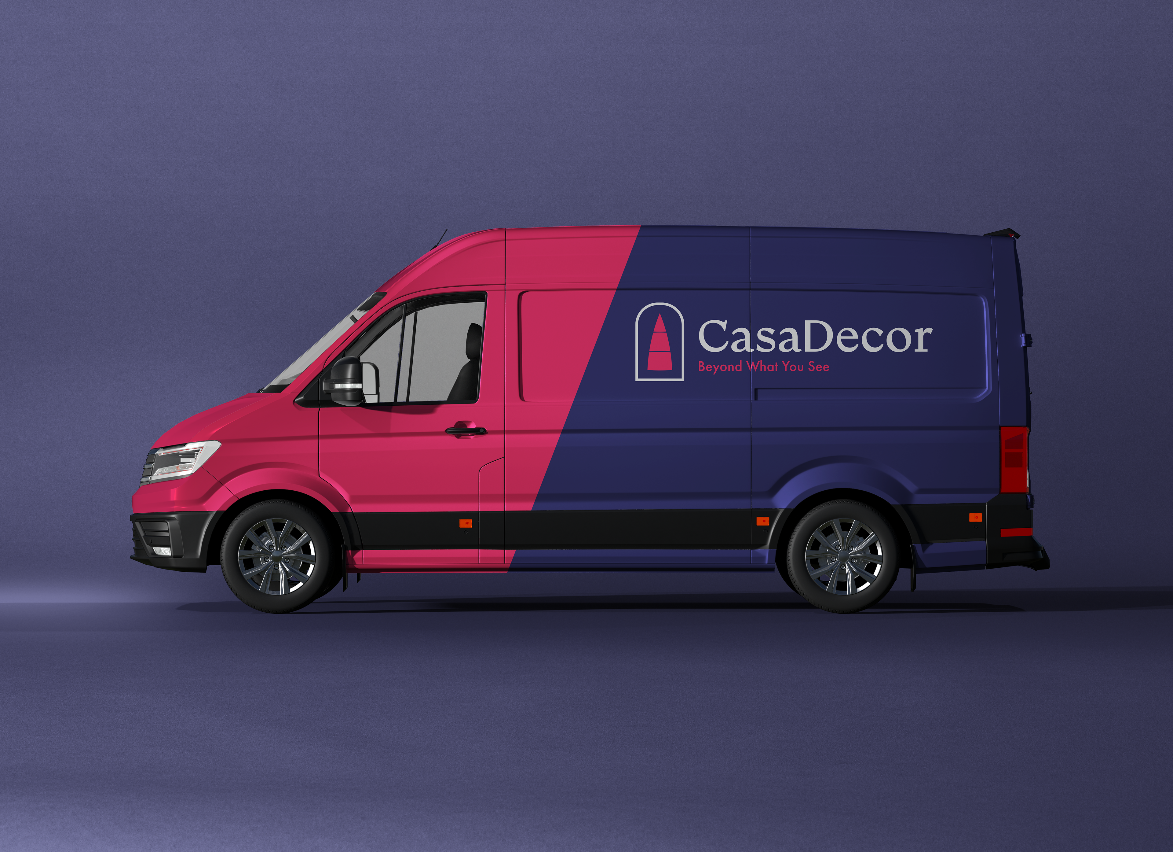
since the brand have two primary colors the van wrapping is made out of these two colors with the logo inverted on a full white color with the slogan. The logotype was choose the secondary one due the nature of it’s size. The finishing of the wrapping creates a trust and friendly bond.

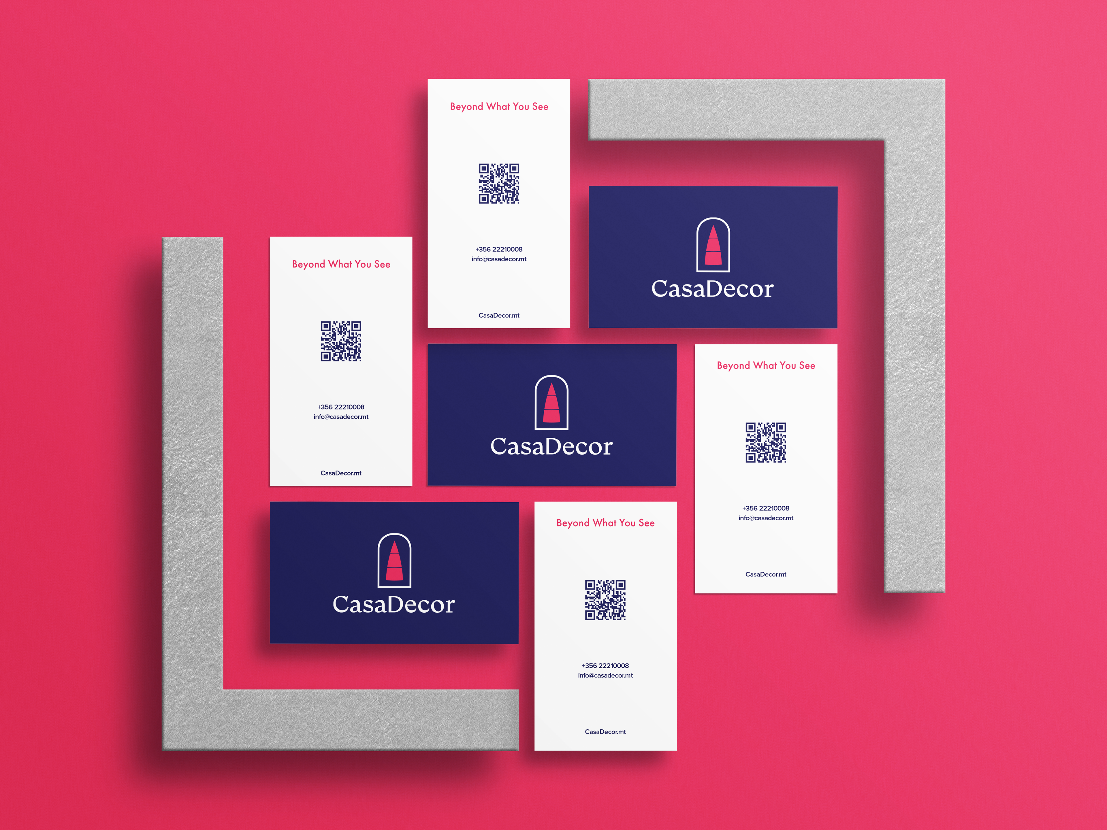
Business Cards

